Project Overview
Context
eatnow evolved as a successor to LunchNow, a food tech startup based in Hamburg, Germany focused on connecting office workers with lunch deals at nearby restaurants. After observing shifts in dining trends and leveraging existing partnerships and data, our team was given the opportunity to develop a broader solution that addressed the needs of all dining experiences.
Individual Contribution
When we started building eatnow, I ended up being the only designer on the team, working closely with three developers and the founders to bring the product to life. Stepping up from an entry-level role to leading design in a startup was definitely a challenge, but it taught me a lot, especially how to collaborate efficiently with developers and the founders in an agile environment. Because of my diverse skill set, I was able to take ownership of the entire end-to-end design process with almost complete creative freedom.
Challenge
In a world where food delivery became the norm, we wanted to bring people back to restaurants by making dining out more efficient, digital, convenient, and social.
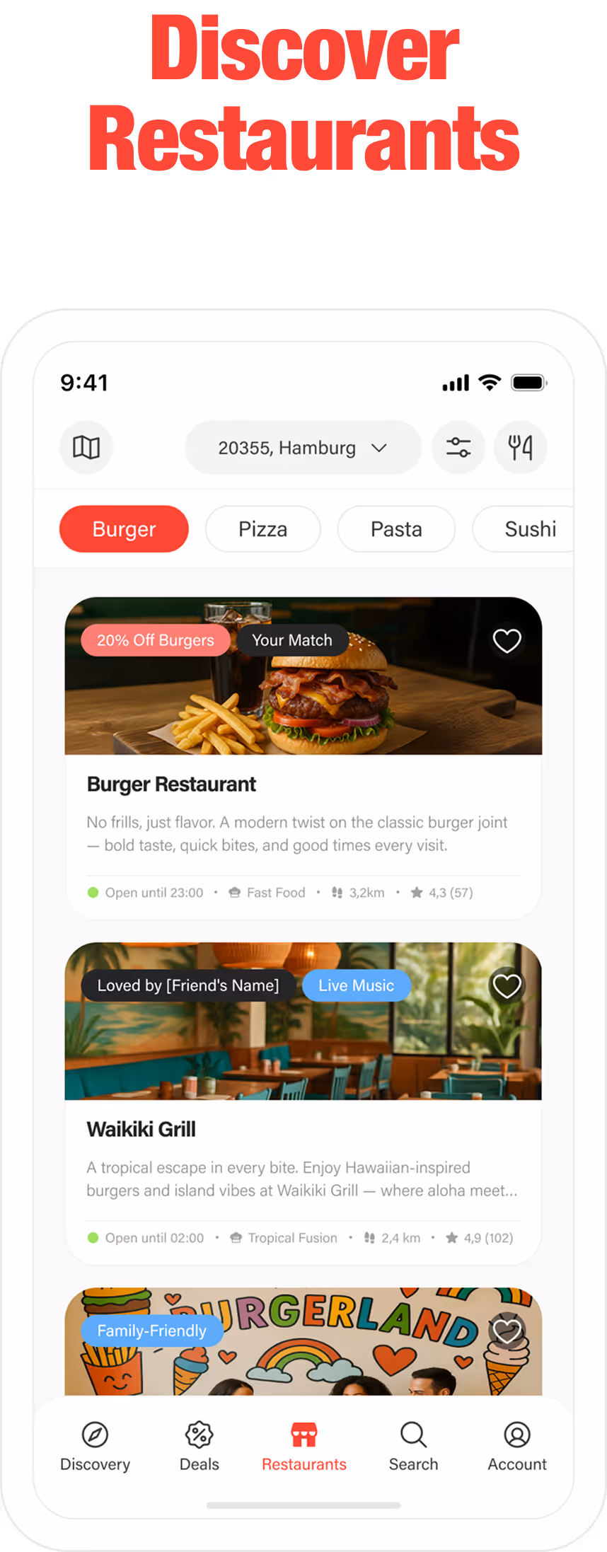
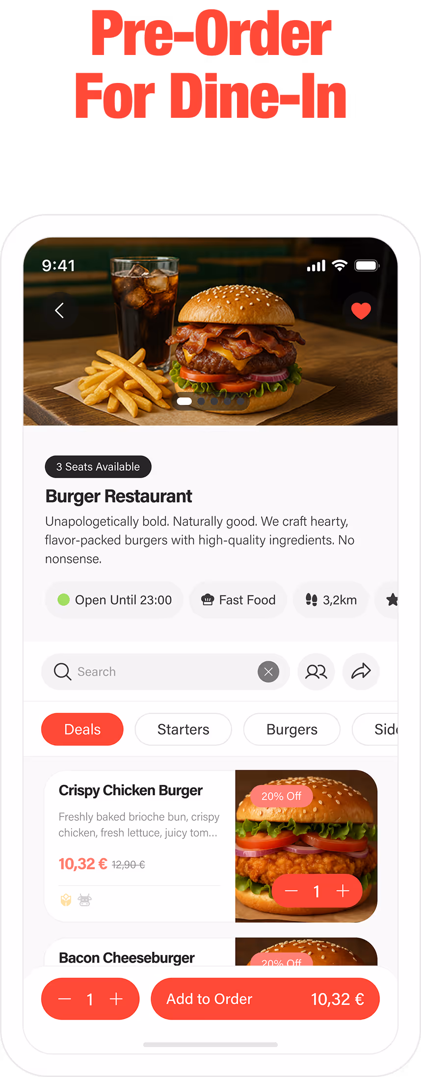
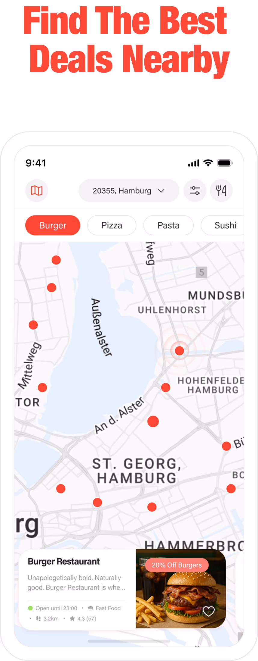
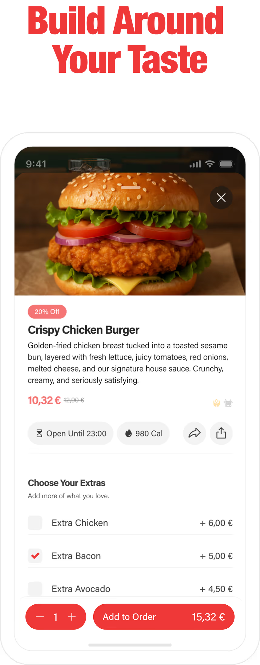
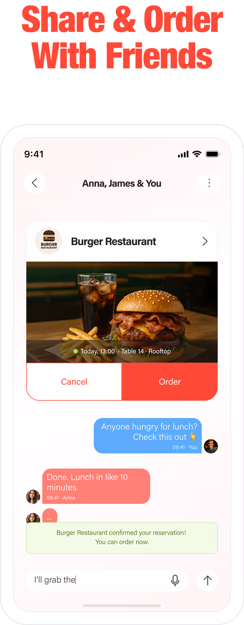
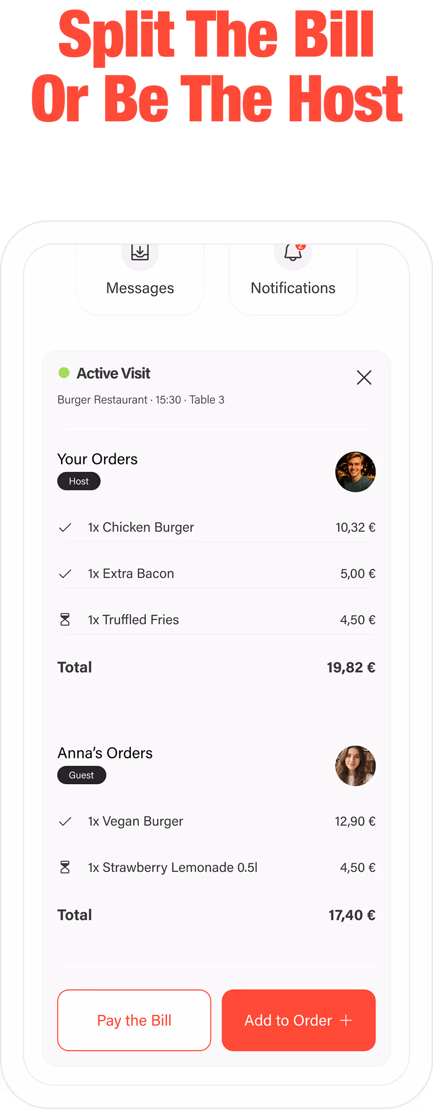
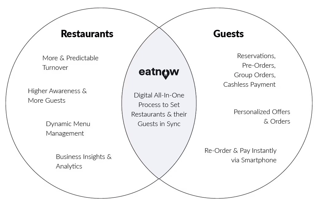
With eatnow, our team aimed to transform the dine-in experience with a digital all-in-one solution. We wanted to empower users to effortlessly discover restaurants and personalized offers, book tables, pre-order, add to order, make contactless payments, arrange to meet with others in a restaurant, and more—all from their smartphones.
At the same time, we wanted to equip restaurants with powerful tools to streamline operations, track KPIs, minimize food waste, and enhance customer satisfaction, so they can adapt confidently to an increasingly digital landscape.
Research & Ideation
Market Overview
In my secondary research, I’ve seen how the dining industry has shifted significantly, especially with the rise of third-party delivery services after the pandemic's contact restrictions. Even companies like Google have jumped into the digital food service space by integrating table reservations, food ordering and delivery options directly into its platforms like Google Search, Google Maps, and Google Assistant.
While our focus was on dine-in experiences, this widespread adoption of digital food services made it clear that people increasingly treat digital ordering as the default way to get their meals.
Food app users in the European food tech market
Yearly growth rate in new European food app users
Download increase due to COVID-19 (trend pusher)
User Research
Our objective was to understand both sides of the dining experience: restaurants and their guests. Their motivations and frustrations showed us which features matter and how the product must perform in order to feel intuitive and helpful.
To support eatnow’s goals, I selected two research approaches that complement each other: semi structured interviews and field studies.
Semi structured interviews gave us a consistent structure for comparison while still allowing participants to share deeper motivations and unexpected behaviors.
Field studies in four restaurants revealed real constraints, workflow gaps, and service issues that are often invisible in interviews. Observing interactions from arrival, seating, ordering, waiting, and paying, to leaving, helped us validate what guests and staff shared.
Across the results of both methods, we identified 8 recurring pain points due to inefficient systems and human error:
Long wait times for ordering and payment
Frequent order errors during busy hours
Limited payment options and difficulty splitting bills
Unpredictable customer flow affecting staffing
Slow table turnover due to manual processes
Lack of customer data for personalization and marketing
Weak engagement and loyalty tools
Food waste due to uncertain demand
COMPETATIVE ANALYSIS
Through an analysis of close competitors, I wanted to identify examples of successful user experience. I also gathered design and user flow inspirations that we could apply.
One thing became clear early on: there are several food apps in Europe offering digital dine-in solutions, and many delivery and table reservation apps, but none provides a unified consumer-facing dine-in experience like eatnow. Although I exclusively found indirect competitors, this research offered valuable insights into industry standards.
Pros
Branded Consumer app for pre-ordering, pickup, and cashless payments.
Integrates with restaurant POS systems.
Cons
No built-in table reservation feature.
Dine-in orders only possible when seated at the table with QR-Code, not in advance.
Weak consumer branding: Mostly unknown.
UX/UI Overview
App with simple and functional design for quick ordering.
Outdated web design with confusing navigation and layout, designed solely for B2B audience.
Pros
Fully customizable for restaurants, giving them full control.
Serves a broader target group beyond just gastronomy, including retail, resorts, events and supermarkets.
Integrates with restaurant POS systems.
Cons
No dedicated consumer app.
Lacks a table reservation feature.
Dine-in orders only possible when seated at the table with QR-Code, not in advance.
UX/UI Overview
Modern and engaging website.
Main User Experience depends entirely on each restaurant’s branding and implementation.
Pros
Budget-friendly.
Table reservation feature available.
Simple web-based ordering system.
Cons
No dine-in ordering or in-app experience.
No consumer-facing app – Customers must visit each restaurant's website.
UX/UI Overview
Basic UI with limited personalization options.
Website caters solely to B2B audience.
Ideation
Based on the information and insights we gathered from the research, we kicked off brainstorming sessions to explore how we could address the pain points and translate market trends into real product opportunities. These maps helped us organize and visualize what each part of the experience could offer. Every idea stayed connected to user needs, competitive signals, and business goals.
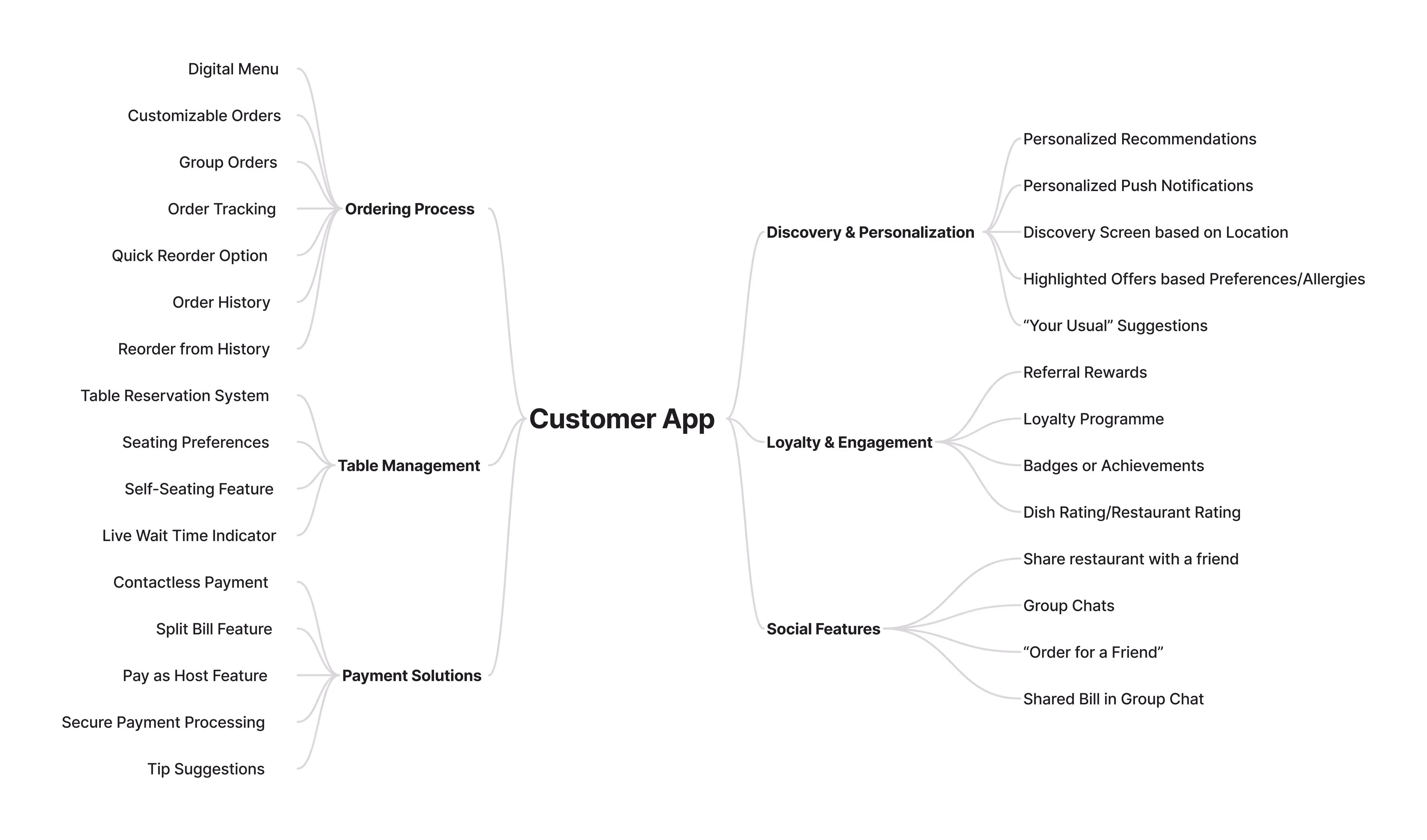
For the customer app, we focused on elevating the dine-in experience through simple ordering that feels social and made dining more fun, with a strong emphasis of personalization features.
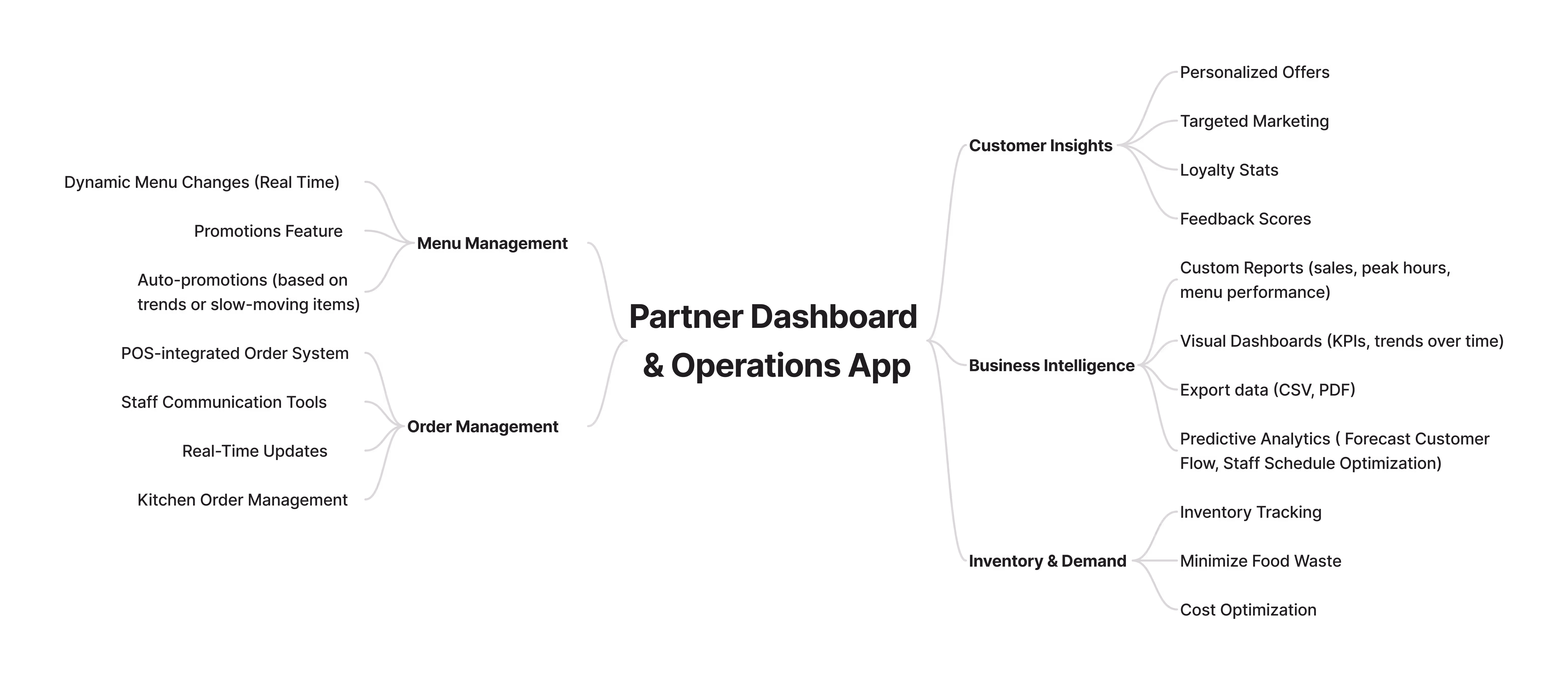
On the restaurant side, we identified a clear need for a partner dashboard, reliable POS integration, and a staff-facing service app. The goal was to improve operational efficiency, support quicker decision making, and help teams deliver better service during busy hours. Restaurants should be able to run smoother while spending more time on hospitality.
Brand Identity
I aimed to create a brand identity that feels exciting, innovative, and playful, to achieve an unforgettable personality that captures the fun of dining out while blending it with a tech-forward experience.
High-contrast colors, bold typography, confident messaging, and playful UI elements came together to create a brand that stands out.
For the logo, I chose a minimalistic wordmark approach, using bold, clean typography to create a modern and sleek feel. The "o" in "eatnow" is replaced with a location pin with a fork cutout: a subtle yet effective visual that directly ties into the platform's purpose of helping users find places to dine. Simple and memorable.

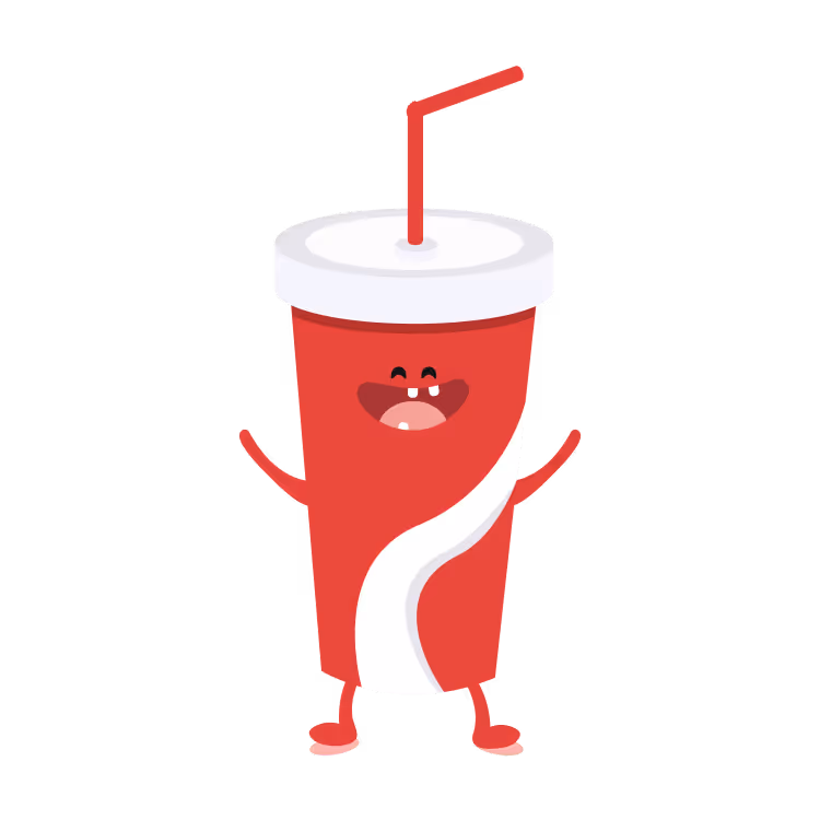
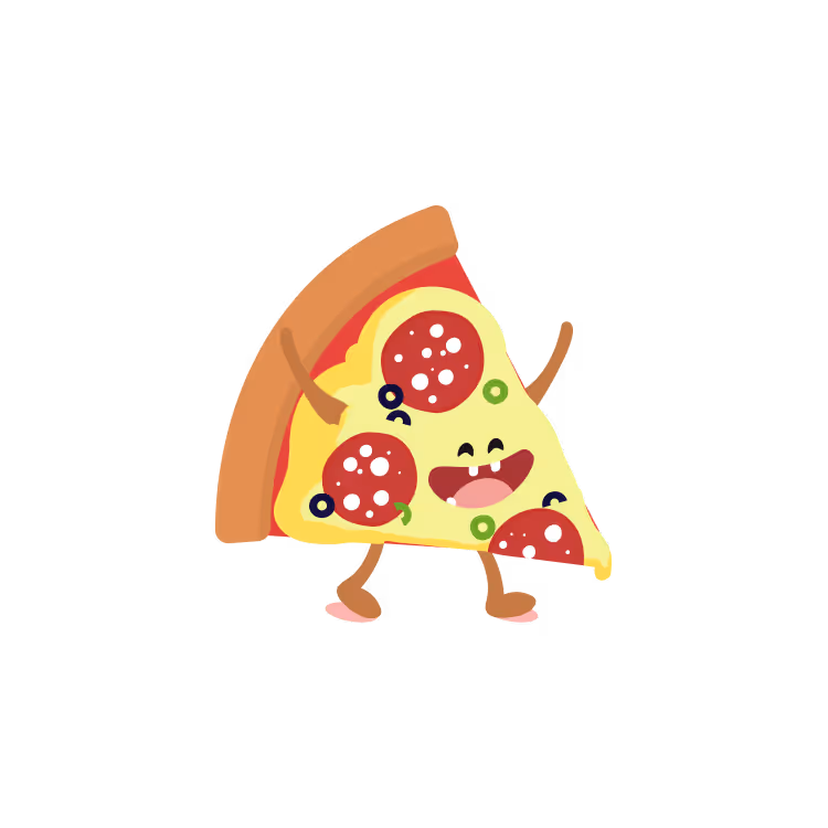
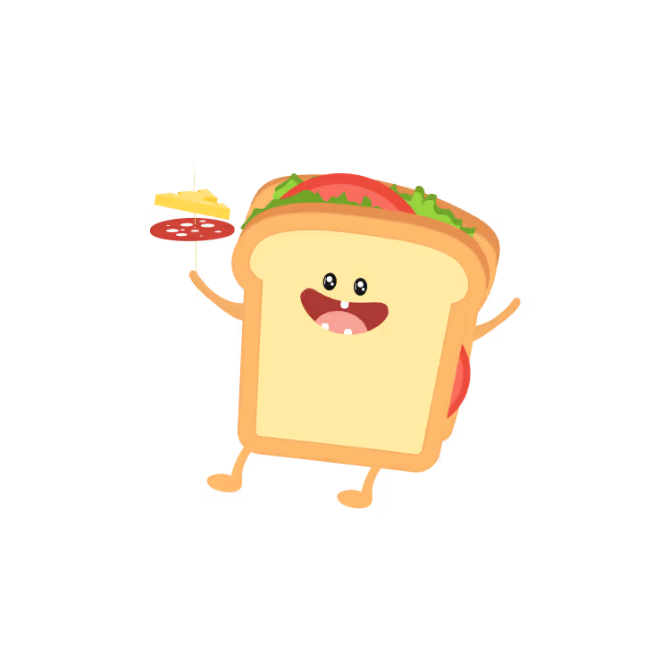
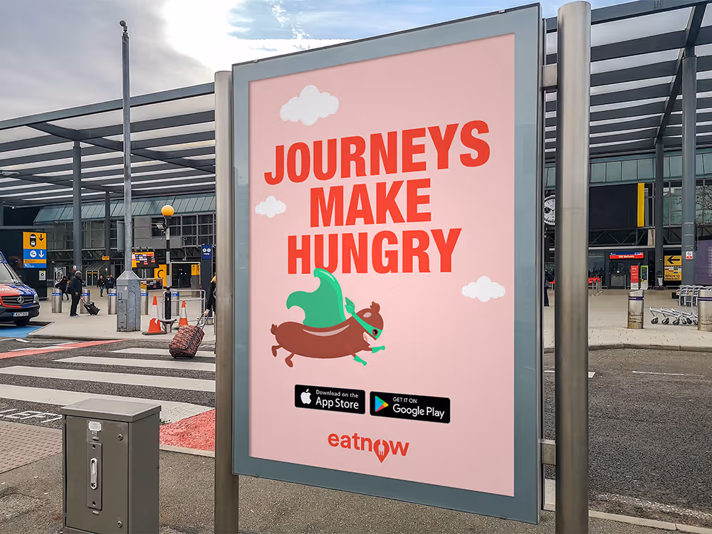
I designed and incorporated both static and animated mascots into the branding and UI, using Adobe After Effects and LottieFiles to bring the characters to life. The mascots add personality and humor to the platform, making it feel approachable, lighthearted, and memorable. The fun brand characters resonate with the audience’s need for joy and playfulness, making the platform more engaging and relatable.
In my opinion, brand mascots are one of the most powerful tools in Marketing. By applying principles of emotional design, I aimed to tap into the user’s emotions, creating an immediate, positive reaction and an emotional bond with our users, that enhances the overall experience .
Product Design
Initially, I designed eatnow’s first screens in Adobe XD. Later, I redesigned the project in Figma to take advantage of its more advanced features.

Design System
The shift to Figma not only helped me get fully familiar with the design tool but also allowed me to create a robust and scalable design system. Beyond wireframes and polished mockups, I built a foundation of reusable components, consistent typography, variables, style tokens, and interaction patterns.


Each screen combines familiar flows with unique features that set eatnow apart, like the seamless in-chat restaurant sharing and group order experience.